

As we start 2024, financial marketers face the same challenges as marketers the world over – continuing economic uncertainty and evolving changes in the digital advertising ecosystem will call for delivering bigger, better results with tighter marketing budgets.
As media budgets continue to be slashed, marketers will need to focus on prioritizing efforts which will have the biggest impact on the bottom line, and which will help their business grow. At this point, it is more important than ever that your brand’s digital assets are effective at converting prospects into customers.
In a recent webinar with our guest speaker Kim Ray (Group Product Manager, Full Story), iQuanti’s Senior Director of Conversion Optimization, Andy McKenna unpacked some of the best practice approaches to landing page design, and how financial services marketers can continuously improve their landing page conversion performance in 2024.
Here are our core learnings from the webinar.
IQUANTI | INSIGHTS
Andy McKenna (Senior Director, Conversion Optimization, iQuanti) was recently in conversation with Kim Ray (Group Product Manager, Full Story) about why building landing pages that convert is critical for banking and financial services, and the best practices for financial marketers to improve performance.
Why should landing page optimization be a priority for financial marketers in 2024?
According to Insider Intelligence, financial services has the third-largest share (11.4%) of the total digital ad market in the U.S. By the end of 2023, the industry was expected to surpass $30 billion in digital ad spend. Yet, with the economic uncertainty and a slashing of marketing budgets that we expect to see across the board this year, financial marketers need to focus on converting more customers for the same (or less) spend. This is where landing page optimization becomes critical.
It may be helpful here to recap some of the key reasons why landing pages are highly effective in converting visitors.
1. They are laser-focused on a single goal.
Landing pages are designed with a specific objective in mind, whether it’s to encourage a purchase, gather contact information, or promote a particular offer. By avoiding distractions and providing a clear call-to-action, visitors are more likely to take the desired action.
2. They are easily testable.
With high testability, landing pages allow you to experiment with different elements such as headlines, images, colors, and calls-to-action. A/B testing helps you identify what resonates best with your audience, leading to a continuous improvement in conversion rates.
3. They give you unique insights into your target audience
Through analytics and testing tools, you can gain valuable insights into visitor behavior, preferences, and demographics. Understanding your audience better enables you to tailor your messaging and offers to match their needs and expectations.
4. They can help grow your email subscriber base.
Landing pages often include forms for capturing visitor information, making them effective tools for growing your email subscriber list. Providing incentives, such as exclusive content or discounts, can further encourage visitors to subscribe.
5. They help with direct measurement of business metrics.
Landing pages allow for precise tracking of key metrics related to your business goals, such as conversion rates, click-through rates, and lead generation. This data provides actionable insights for optimizing your marketing strategies.
6. They help contextualize offers or campaigns.
Landing pages provide a dedicated space to elaborate on the benefits of your offer or campaign, giving visitors the information they need to make informed decisions. Adding context helps to address potential concerns and persuades visitors to take the desired action.
7. They help build brand value and strong first impressions:
A well-designed landing page reinforces your brand identity and creates a positive first impression. Consistent branding, compelling visuals, and concise messaging contribute to building trust and credibility with visitors.
In essence, landing pages serve as focused and optimized touchpoints in your marketing strategy, facilitating better engagement and conversion with your target audience. Yet we have seen that many brands lack focus on optimizing landing page experiences, resulting in poor campaign efficiencies.
Time after time, we have come across banks and financial services brands, both large and small, who invest 75-80% of their digital acquisition budgets on paid media and yet fail to pay attention to what happens after that click.
Financial marketers need to ask: Why are my users converting, or not converting? What are the lessons I can learn from their actions that can help me optimize the purchase journey? How can I improve the ROI of my landing pages?
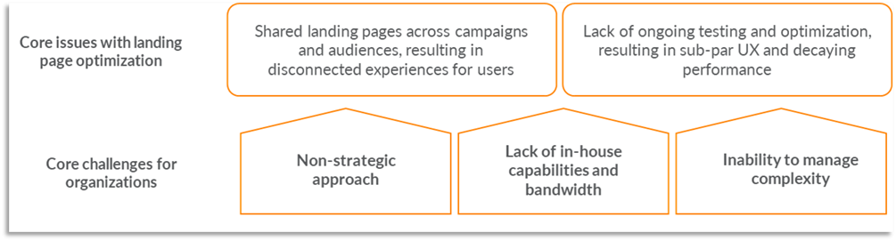
At iQuanti, we’ve seen five core challenges to landing page optimization in enterprise companies.
We see generic landing pages shared across multiple media campaigns and audiences resulting in disconnected experiences, and a lack of ongoing testing and optimization which leads to a suboptimal user experience, ultimately eroding conversion performance.
This is often underpinned by an approach that isn’t strategic. We’ve seen a lack of holistic thinking where bank marketers invest in media and in building a landing page, but lack a robust methodology for sizing up the impact on profitability.
We often also see a lack of in-house capacity and capabilities. Many financial services brands have limited UX and analytics capabilities and constrained design and tech resources, which hinder their ability to test, experiment and constantly improve.
Finally, we’ve also observed that organizations often struggle with managing complexities. Ineffective program management or limited tools and processes to manage and ensure regulatory compliance can hinder or even halt rapid testing and optimization efforts.
7 landing page design and testing best practices to follow in 2024
Here are our top five recommendations to ensure your landing page design delivers higher ROI in 2024:
1. Use free tools to validate your landing pages.
A good place to start when validating your landing pages is with the following set of free tools:
a. WAVE® Web Accessibility Evaluation Tools:
WAVE is an evaluation tool that helps authors make their web content more accessible to individuals with disabilities.
It checks how well a site adheres to the WCAG accessibility guidelines, and is important because good accessibility and good usability are inextricably linked.
b. Color Contrast Accessibility Validators like Ally:
Having a good color contrast between your fonts and backgrounds not only helps vision-impaired users to read your content, but it is a good practice to do this for all users, as everyone will benefit irrespective of the device they are using and it’ll also help make important information more easily distinguishable. Free tools like Ally can help you make these improvements quickly. 
c. Website Performance Testing and Monitoring Tools like GT Metrics & Google Page Speed Insights:
You want your landing pages to load as fast as possible. Free tools like GTmetrix and Google PageSpeed Insights will tell you where your page elements are slowing down website performance and whether your images are sufficiently optimized for the web. Both tools provide step-by-step recommendations for fixing issues that you can move to implementation right away. 
2. Use consistent messaging to ensure a logical transition from the ad to the landing page.
When a visitor arrives on your landing page, you’ve got a split second to match user intent – letting them know whether what you’re offering them aligns with what they’re looking for.
Any doubt or confusion at this stage is likely going to lead to them hitting the back button or Xing out on their browser.
What does this mean for marketers? In the context of paid search advertising, matching the on-page copy to the messaging on the ad that your visitors came in from drastically reduces the chances of them leaving.
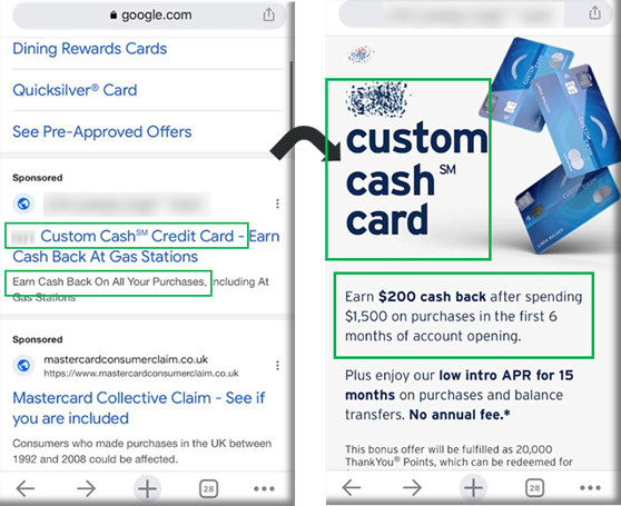
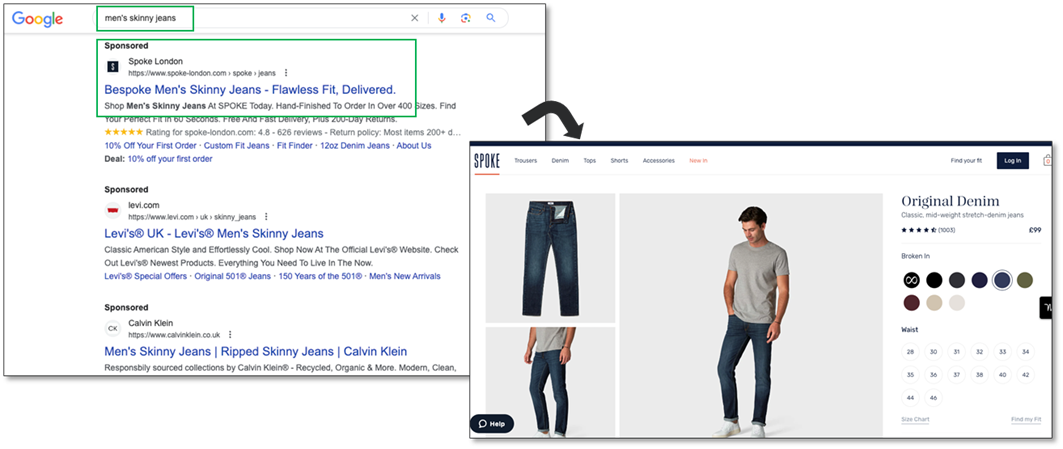
Sounds logical and straightforward, doesn’t it? But you’d be amazed at how often we see this simple rule broken. Here is an e-commerce example to illustrate this.
Say a user searched for “men’s skinny jeans” and clicked on a paid/sponsored ad in the search results (as shown below). The user wants to buy a new pair of skinny jeans, and the ad copy matches her/his intent.
The user clicks through to the landing page of Spoke London but finds that there’s no products/messaging around skinny jeans on the page! Yes, there are a bunch of images and color selection swatches, but nothing that specifically calls out to the user and tells her/him whether these jeans are skinny fit or not.
At this point, the user will likely be disappointed and frustrated, and leave the website, probably never to return (88% of users are less likely to return to a site after a bad user experience, according to 99Firms). This is a missed opportunity and lost revenue for the brand.
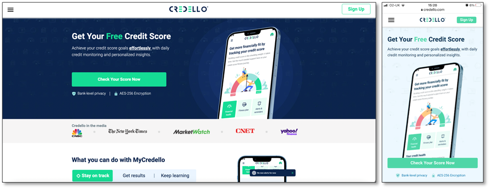
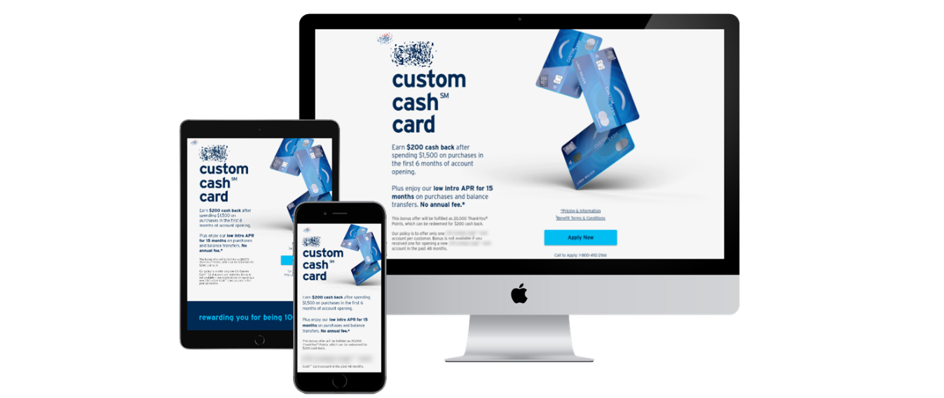
3. Optimize the hero area for conversions
The hero area of a landing page is the area above the fold area. It’s the first thing that your visitors are going to see, so it should be where you place the most important information and the call-to-action.
Let’s look at an example from Credello, a personal financial management portal that serves North America. The screenshot below is from a landing page for Credello’s credit score checker tool. The key features include
- Colors, fonts, and other elements consistent with Credello’s branding
- A strong value proposition in the headline
- A high-quality product image
- A compelling call-to-action in a bright box, and in a contrasting color
- Trust inducers in the form of privacy and encryption callouts beneath the CTA button
- Social proof in the form of media coverage
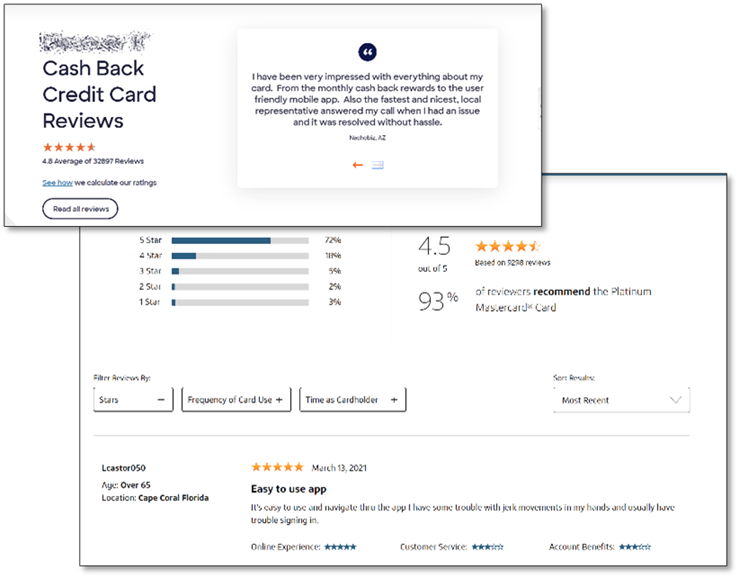
4. Include authentic social proof
Testimonials, reviews, and ratings help to cut through the noise, and lend credibility to your brand in a way that your website copy cannot. Keep the testimonials and reviews verbatim to retain their authenticity. Do not filter out all negative reviews either – keep it believable and honest. People can usually see through fabricated testimonials, so including details like full name, job title, location, and even a photograph can help.
Here are two examples of websites that do this well. The scrolling panel which allows for multiple reviews on a page and the option to link off to all reviews via a CTA button, are good features to have.
Combining reviews, ratings, and testimonials within a single section, with eye-catching graphics and clear typography, can be an effective design choice.
5. Keep distractions to a minimum on the landing page
Your landing page should have a single conversion goal.
Focus on removing any unnecessary elements like navigation, links to other sections and additional calls-to-action. You may even want to disable the link to the home page from the logo in the top left of the page to prevent users from clicking out of the journey.
In the example below, there’s no clutter above the fold on desktop – just a header, intro paragraphs, a single call to action, a product image, and a logo.
6. Use data analytics to guide your landing page design decisions
Our recommendation would be to not get limited by trying to understand why some users convert. Instead focus on the large percentage of users who landed on your page but did not convert. Ask yourself:
- Did they land on my website by mistake?
- Was the info/product they were looking for not at the forefront, and easy to find? Which of my pages have the highest bounce rates?
- Did my landing page fail to meet their expectations? What are users trying to click on, and are these links/buttons working as expected?
- Did they want to convert, but got stuck somewhere along the way? Are your users having trouble completing your forms?
- What do my users do if they don’t follow my “happy path” to conversion? Do they quit and leave, or do they click through to other pages?
- What would have made their experience smoother? What should change?
- What is the incremental benefit or increase in conversions that can be expected if these changes are implemented?
Here are four areas we recommend you focus on. These will help you better understand your users’ behavior, and help inform your landing page design.
a. Look at pages with high bounce (or exit) rates:
High bounce rates usually signal a mismatch of expectations or a major usability issue, so identifying pages with a high bounce rate is a good place to start. You can find this data in your web analytics, and then pair it with other tools like heat maps or session replay to home in on any issues the user is experiencing.
b. Understand common user journeys for your customers:
In addition to analyzing your happy path, check out other user journeys or flows and see what users are doing. Understanding what users do when they don’t follow your happy path gives you clues into what other information they might need before converting.
c. Monitor friction in user journeys:
Look at what users are clicking on. Clicks are a sign of “attempted action,” or simply what catches users’ eyes. Studying these signals allows you to ensure that these elements are, in fact, clickable and do not hinder the conversion journey. In many cases, it also helps you validate what you think you know about the happy path you have built for the customer and identify pitfalls.
d. Analyze your forms:
Forms are another area of opportunity. The friction they cause is so often overlooked, and we have seen customers find huge wins with form optimization efforts alone. Use web analytics and session replay tools to analyze different form features, as well as to catch any hidden challenges that the users are facing.
7. Keep testing and continuously improving your landing pages
Landing pages are never one-and-done. It is important to continuously improve them. The best way to do this is by running A/B tests so you can validate your design decisions in a way that is as scientific as possible, and not based on a hunch or a gut feel.
If you want to give your tests the best chance of winning, it is critical to have a process in place to do this. Here is a framework we would recommend:
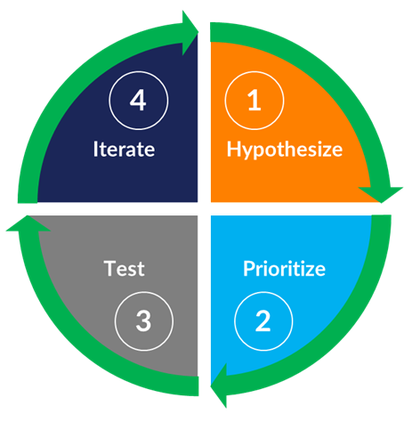
Step 1: Generate problem statements and hypotheses.
A well-thought-out problem statement and a robust hypothesis ensure that your test is focused on the right objectives. They also provide a hub for closely themed test ideas, as well as holding your tests accountable for the result.
For example, let’s say your problem statement is that the hero area of your landing page does not communicate the key value propositions of your product. You hypothesize that if the key value proposition is included in the header, then the application start rate will increase because users will have a clearer idea of which product will suit their needs.
You now have a tangible objective – the aim of each test you run is to prove or disprove the hypothesis. It also provides an opportunity to brainstorm testing ideas and it provides rationale behind the changes that you want to make.
Step 2. Prioritize the hypothesis and test ideas to run first.
At iQuanti, we have a home-grown prioritization framework that we have developed specifically for banking and financial services websites. The criteria we use to measure the test ideas are potential, impact, effort, and evidence. Competitor benchmarking gives us a good indication of how much improvement can be made, and what the impact of the changes would be on the bottom line (in terms of conversion rates, dollar lifts etc.). This then allows us to prioritize the tests accordingly.
Step 3. Run A/B tests in priority order.
Once you’ve prioritized the test ideas, you want to validate them by running A/B tests.
Step 4. Iterate and keep trying to beat the winner!
You should continuously run challenger experiments against the winner to get incremental gains. You need to revisit your research regularly to pick up new test ideas, and then keep stress-testing and tweaking your hypothesis. By following this process, you’ll give yourself the best chance of developing landing pages that turn your visitors into prospects and your prospects into customers.
Do you feel confident you are ready to optimize your landing pages for better conversion rates in 2024? If you need help assessing your 2024 landing page optimization strategy, please reach out to our conversion optimization experts today!