A study of the top 12 elements of landing pages that aid in conversion based on an analysis of 5 top landing pages for credit cards.
When Scott Adams said “the first time you see something that you have never seen before, you almost always know right away if you should eat it or run away from it”, he was talking about food. But every time I read this quote, I immediately think of my landing pages, and how very applicable the principle is to how viewers react to my landing pages.
A user clicks on a search ad because the ad appeals to his needs. The landing page is almost always a user’s first introduction to a brand in the context of meeting his needs, be it information, evaluation or immediate purchase. Studies suggest that users decide whether they want to buy from you or not in 8 seconds of landing on your page. 8 seconds!
If you are a marketer, your challenge is to make sure that you grab their eyeballs and assure them that they would get the best of what they are looking at in those first 8 seconds. This is a study of those landing page elements that can make or mar your first impression.
Shameless plug: I’ve borrowed the landing page elements and their priority order from our QSM tool.
We did a quick analysis of the top 5 ad landing pages from Google for the keyword “Buy Credit Cards”. The assumption was that being a high-involvement B2C product, the users searching for this keyword will be closer to the purchase funnel, and the impact of a landing page in sealing a sale is crucial at this stage.
Here is our quick analysis of the elements that impact the performance of the top 5 landing pages for “Buy Credit Cards”:
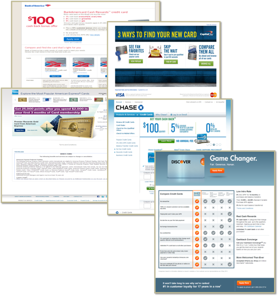
Do you see how the major credit card companies have optimized their ad landing pages to increase customer acquisitions?
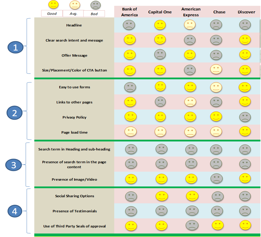
Here are the elements we scored the landing pages on (with varying weightage):
Set 1:
Headline – Does your headline give a sense of what the landing page has on offer? Is it clear and concise?
Clear Search Intent and Message – Does the messaging on your landing page directly address the need/search intent expressed via the keyword?
Offer Message – Why should the user buy from you? Do you have discounts/offers/packages/special benefits?
Call to Action – Is your CTA clearly visible and persuasive? Do you differentiate your major and minor CTAs using size and color of buttons?
Set 2:
Easy to use forms – Does your contact/application form exhaust the user with unnecessary form fields?
Outbound Links – Do you have lot of links on your page which may distract the reader from immediate purchase?
Privacy Policy – Do you build credibility with a clear statement of privacy policies?
Page Load Time – Does you page load fast enough to keep a visitor from bouncing off?
Set 3:
Use of search term in heading – Do you address the need expressed through a search query in your headings and sub headings?
Use of search term in content – Is the search term used in your landing page content?
Use of image/video – Do you use apt images and videos to increase customer engagement?
Set 4:
Social Sharing Options – Do you enable the visitor to share your page with others?
Testimonials – Do you have user reviews that add to your credibility?
Third Party Seals of Approval – Do you have awards/accreditations/affiliations that add to your credibility?
We suggest you use this as a checklist next time you are thinking about building an effective landing page. Ask yourself these questions, and mix and shake them up a little and, voila, you have your own secret recipe to a healthy landing page!