

Web forms are integral to enterprise websites, act as conversion points. They add to user engagement and experience. Conversion rate optimization, or CRO helps enhance web forms to ensure conversion.
Read our explainer, “What Is CRO?”
Much of the time, CRO’s focus is on encouraging visitors to start and/or complete some kind of signup process. Whether you want your visitors to make a purchase, fill out an application or simply provide their contact info for follow-up, web forms are how you move conversions forward.
Here are our best practices for creating winning forms, based on our CRO engagements with various F-500 brands.
Prioritize clarity and brevity
As an internet user, you’ve no doubt seen a web form that stopped you in your tracks.
“Why do they need my office address? Or my company’s annual revenue?”
Form fields like these don’t just frustrate site visitors – they can actively reduce your form completion (i.e., conversion) rates.
A tip we give all of our CRO clients: Only collect the information that you absolutely need.
Financial products may require items like your address or Social Security Number, but for lead capture, all that’s required may be just a name and an email address.
Especially for maximizing the performance of your web forms on mobile, it’s important to minimize data entry. All of your visitors want a seamless experience – particularly those on a data connection and/or small screen – and keeping your forms short is one of the best ways you can deliver on those expectations.
Reduce barriers to completion
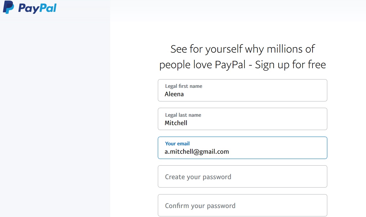
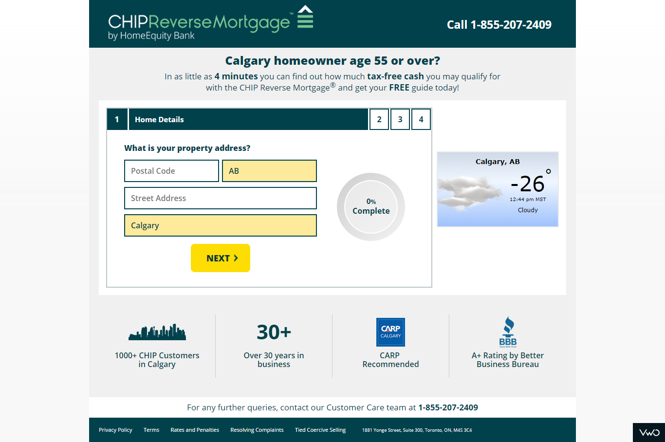
Another way to streamline conversions is to provide navigational aids. For simple signup processes, such as lead capture forms, greyed-out text can signify the information that’s meant to go in each form field.
In the example shown below, the form field being filled is highlighted in blue font.
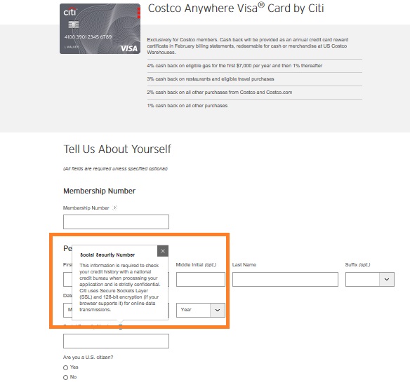
For more complex conversion flows, like applying for a credit card, pop-up overlays are useful for communicating additional details to the visitor or proactively answer user questions.
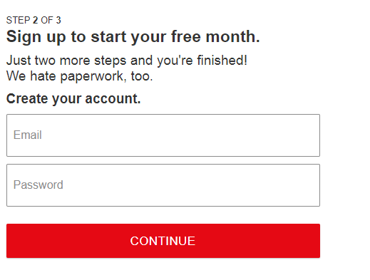
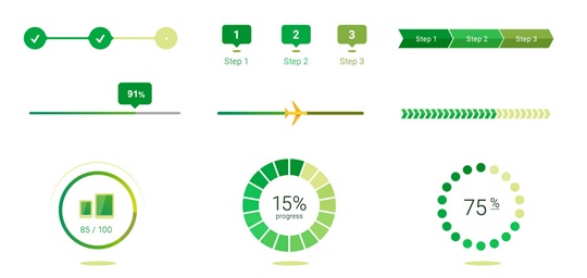
And in multi-step conversions, graphical elements such as progress bars help give users confidence that they’re moving forward. Progress indicators are even becoming commonplace in articles on media websites – demonstrating how displaying progress boosts engagement with all different kinds of web content.
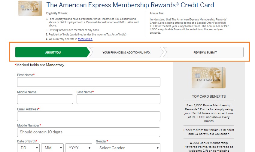
The graphics below illustrate how progress of a web form completion is usually portrayed in websites:
Prepopulate forms with key visitor information
Keeping web forms short and simple helps facilitate form completions. Knowing this, are there some form fields which can be pre-populated based on a user’s location, age group, language, etc.?
Imagine you have a social ad that points to a landing page. If the social ad is targeted to residents of a certain city or state – and the landing page also has geo-specific verbiage – you can populate any forms on the page with the city and/or state.
It’s a small detail, but if users see they have one or two fewer fields to fill out, completion likelihood will increase.
An additional, more advanced step, if you cookie your site visitors, is to customize your web forms to recognize a new vs. returning user. This kind of personalization greatly increases purchase likelihood.
“Personalization, fully implemented, can unlock significant near-term value for businesses—such as 10% to 20% more efficient marketing … and a 10% to 30% uplift in revenue and retention,” consulting firm McKinsey says.
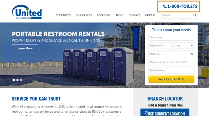
Provide live assistance via phone or web chat
What do phone numbers have to do with web forms? After all, if you provide a great online experience, no one should need to call you.
That may be true in an ideal world – but in the real world, your users may have doubts and questions as they navigate an online purchase or even while filling a web form. If you sell in a brick-and-mortar store, your sales associates can provide answers and assurance. On a website, however, consumers can feel like they’re on their own. Having the opportunity to speak to someone and get your questions answers on the fly can mitigate these negative feelings.
Even if they don’t actually reach out, consumers gain confidence when a phone number or chat window is prominently displayed on a brand’s website. That confidence drives measurably more form completions.
The Final Word
Too often, web forms are clunky, web 1.0 relics. Optimizing forms to be more concise, more mobile-friendly and simpler to navigate contributes to conversion rate optimization (CRO), ultimately helping to drive more conversions from your domain.